Rupen's Projects
Rupen Rao Info Card
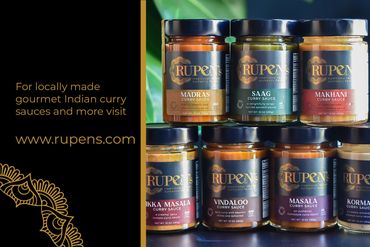
RUPEN's asked me to create a 4x6 informational card that provided clear instructions on where to find their products while staying on brand with their established aesthetic. I used an original graphic from a previous collaboration that is pulled from the RUPEN's logo and made sure the product was easy to read.
Final


Rupen's Spice Chart
I created this graphic in collaboration with RUPEN's in order to showcase all of their products and highlight the spice level in a way that was consistent with their branding. I created the graphics and edited the product images that were provided by RUPEN's.
Rupen's Spice chart

Rupen's Media Kit
RUPEN's wanted a fresh take on their brand while still nodding to the original design. As the first project we collaborated on, I decided to create the mandala graphics inspired by the original logo and incorporate the product photography into the basic shapes in order to freshen up the brand's identity.
This website uses cookies.
We use cookies to analyze website traffic and optimize your website experience. By accepting our use of cookies, your data will be aggregated with all other user data.